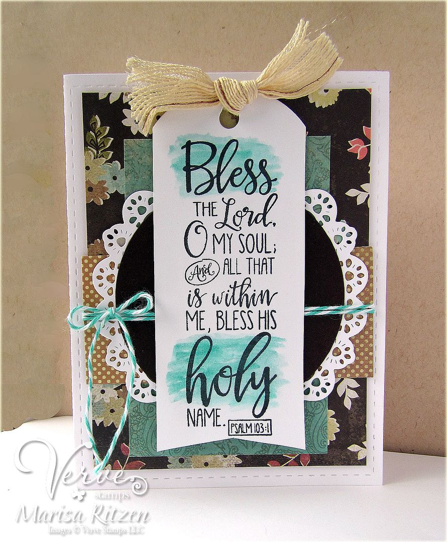
This is my original version, but it looked a bit to plain and the background paper is really a lot stronger than I thought it would be and a bit overpowering -- or maybe it is just a darker colour than I usually use so it stands out to me? I tried to tone it down a bit with the tan and turquoise, and then I cased Teresa's gorgeous card found here by water colouring the two words to make the sentiment stand out.
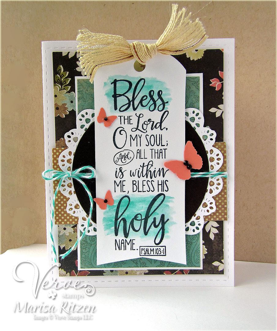
This is my "jacked up" version. I added a white mat and some coral butterflies to pull in the rusty colour in the background paper, however, now I think it is too busy LOL! Can't win for losing. Which do you like better? Or, are you like me and batting zero - which is fine too! Be honest. I love constructive criticism as one can always learn from it :)
Wishing you a fabulous day, and glad today is another day which means I can move on and create something else :)

What's In It?
Stamps: Good Work (Verve Stamps)
Paper: Hipster (Basis Grey) , Early Espresso (Stampin' Up),
Ink: Black
Accessories: Stitched Rectangle Die (Lil' Inker), Tag Die (PTI), Doily Die (Top Dog Dies), Twine, Ribbon, Glue Dot, Dimensionals
7 comments:
That watercoloring really makes those words pop. I will have to give that a try!
I think most of my cards go like that!!! Not quite right - add more - definitely not right - move things - even worse - and on and on!!
I'm glad you posted though because I really love the way you have highlighted the main words - it's a fabulous way to use a bigger sentiment.
Gorgeous! Love the watercoloring and how it makes the words pop!
I love seeing your use of color -- this is such a gorgeous card!
Oh, Marisa, dressed up or down, this is gorgeous! I love the colors, and I especially love this verse. I am awaiting my package now (and have tracked it). Hugs!
Both are beautiful Marisa, but I personally love the way those coral butterflies pop!
If either of those cards landed in my mailbox, you would definitely hear me cheering with joy! Both are gorgeous in their own way and yes, we already know I'm crushing over the butterflies! I so enjoyed seeing your 'do this'...hmmm...'or that'...process! Most of my cards involve a lot of hmmmm-ing!
Hugs~c
Post a Comment