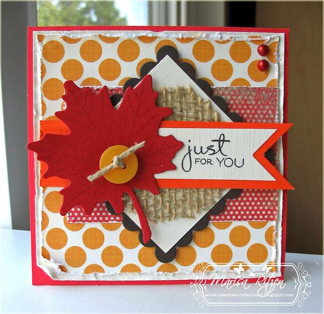
 Had so much fun making the round version of this week's Mojo Monday sketch, I thought I would make the square version as well. As fate would have it, a few challenges provided a excellent excuse for the use of my beloved maple leaf...happy sigh... :)
  I'm combining the sketch with a few challenges out there this week: 4 Crafty Chicks - use leaves on your card. Hello!! Great excuse to bring out my maple leaf again. Delightful Challenges - use distressing on your card. Roughed up the edges with my distressing tool. Finally, Friday Mash Up - use Indian Summer as your inspiration.
In addition, I actually jumped on the "trendy" band wagon and used some burlap on my card. As fate would have it, I tripped across some wired, burlap "ribbon" at one of the local scrap booking stores I frequent, so I bought some in cream and kraft. Just love the texture it adds to a card and it is a perfect companion for leaves! Needless to say, there may be a bit more showing up on a card or two shortly wink, wink.
My daughter and I were having a debate about which picture was better. She likes the one below, I like the one above. The top one is crisper and has darker colours, but the main point of contention is a close up versus a more distant shot. Which do you prefer? Please be honest as it is a debate I have had in my own mind for some time. Thanks!
Wishing you a delightful day!

What's In It?
Stamps: Purely Sentimental (Verve), Leaf Prints (PTI)
Paper: Country Lane (Echo Park), Stella and Rose (My Mind's Eye), Real Red, Only Orange, Early Espresso, Cream Linen
Ink: Black
Accessories: Scalloped Square and Square Nesties, Maple Leaf Die (PTI), Crimper, Distressing Tool, Burlap, Button, Twine, Red Half Pearls, Dimensinoals

21 comments:
Gorgeous, gorgeous card Marisa! Have to say I like the top picture a bit better. Seems like the orange gets a bit neon on the bottom one.
Your bit of burlap is perfect, Marisa. I think my card yesterday sent you into a yearning to use your leaf die. LOL Your card is gorgeous.
I have to say I think I like the top card best...shhhh..don't tell your daughter.
Well I can see why you love the maple leaf :)
I prefer the top one ... "older" eyes need crisp and close up ... Ha! Great card.
Jilly <><
Fabulous fall card! Love the added burlap! I bought a teeny bit months ago and have yet to use it. LOL!
Thanks for the inspiration!!!
Hmmm...had to jump back and forth between shots to see which one I like better. I'll go with the top one. The card's details are crisper, like you said.
Either way, a beautiful card and a fun use of trendy burlap!
HA! I had to open 2 windows and look at them side by side -- end results for me? 2nd one. I thought it had more clarity.
Meanwhile haven't been able to comment [funny internet] this last week, though I have enjoyed your cards! :)
cheers for burlap! I'm thinking it's not too too trendy as I've been using it for over a year now...it's the perfect rustic textutre! I like the top one too...the colours seem more natural. Good eye!
I love them both, but this one is extra-special with that fun little burlap..I have some and am hoarding it!
Super cool, love the colors, thanks for joining us at 4 Crafty Chicks for our leaves challenge! TFS!
The top definitely! Love the burlap and the fun papers - this is so perfect for Fall/Autumn. Such a cute card!!!! Hugz!
Love the Polka dot paper, leaf, and burlap! Wonderful!!! Black just makes everything pop! Distressing is perfect!
Your Fall card is sooo lovely! Love your design. Thanks so much for joining us this week at Digital Delight Challenges. I have blog candy available too if you are interested!
Denise
DDC-DT
Oh my love fall and girl you rocked it. That maple leaf cut out is fabulous.
Hugz,
Christine Delightful Challenges Dt
This is so wonderful! Love that big leaf and the burlap in the background! Fabulous. Thanks for sharing with us at The Friday Mashup!
Beautiful layout and elements... just love the burlap! Thanks for joining the Friday Mashup this week.
I love this card. It's just got that perfect Fall feel to it with these gorgeous papers/colours and that wonderful red Maple Leaf. The touch of burlap is perfect here.
Marisa...love the large red leaf...the burlap adds such great texture! I like the top picture best...true colors...great clarity!
Beautiful!! Love the burlap. And I like the top pic best :)
I adore this card! Also, I like the top one better.
Love the use of the burlap...it looks fantastic behind the sentiment panel. I've been on a burlap kick lately...over the Spring I bought a yard of it and it's always staring at me to be used, so.....I'm obliging. You've done a great job with the distressing, too...I think this may be a trend for you.... :)
Post a Comment