
Welcome to our May 2013 Spotlight Hops! Today we're shining our Verve spotlights on the new stamps Take Note and Happy Graduation Plain Jane. Each of the release team Divas and Guest Divas below has posted her first look at these new stamps today.
As you hop through the list below, you just might see some super sneaky peeks of new coordinating dies and ribbons, so keep your eyes peeled! Everything you see previewed along today's hop will be available in Verve's online store on Friday, May 10.
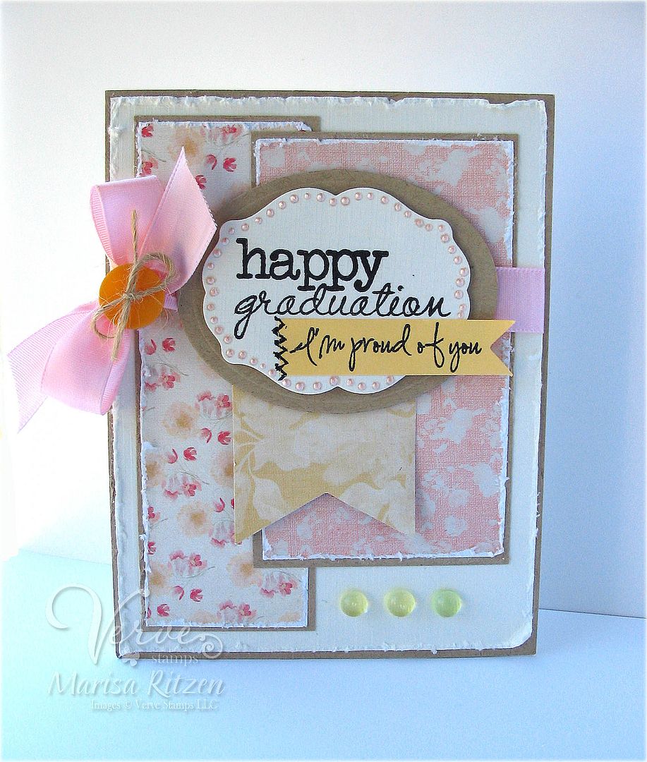
If you have come here from Christyne's blog you are right on track. If you just happened up on the Hop, you can follow the list below to get caught up. For my card today, I combined both of today's featured sets on one card by adding the "I'm proud of you" tag under the Plain Jane sentiment. I used MME's In Bloom papers as I am hopelessly addicted to them. Love the colours and patterns in this pack - perfect for a totally girly graduation card :)
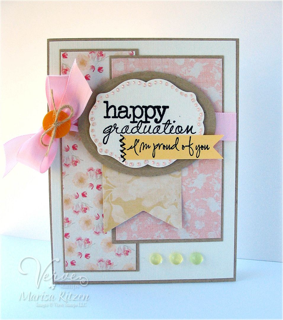
The card seemed to need a little something so I distressed the edges. At the end of it all, I couldn't decide if I liked the straight edged card or the distressed card better so I've posted the both! Which one do you like better? We had a split vote at my house so the decision rests in your hands LOL!
Want to win some shiny new Verve? We'll be picking a random commenter on one of the hop spots below to win today's featured products! So be sure to leave a little comment on all the blogs below to increase your chances! Check out the Verve Blog for all the prize details and deadlines. Woohoo! Let's get started...

| 1. Julee | 8. Andrea |
| 2. Charmaine | 9. Jen M. |
| 3. Teresa | 10. Laurie W. |
| 4. Stacey | 11. Laurie S. |
| 5. Amber | 12. Janelle |
| 6. Christyne | 13. Maureen |
| 7. Marisa | |
Next in line is Andrea, and she will be sure to have an amazing creation for you to oggle! Make sure to come back tomorrow for Day 2 of our Spotlight Hop! One of my favorite sets from this release will be showcased!

What's In It?
Stamps: Take Note and Happy Graduation Plain Jane (Verve)
Paper: In Bloom (My Mind's Eye), Kraft, So Saffron (Stampin' Up), Cream Linen
Ink: Black
Accessories: Curvy Bookplate Die, Oval Nestabilities (Spellbinders), 5/8" Pink Satin Ribbon, Pink Liquid Pearls, Button, Twine, Glue Dot, Dew Drops, Dimensionals
66 comments:
So perfect for a young woman to receive at her graduation Marisa. xxx
Oh a new Verve release?!!! FUN!!! GREAT cards. I can't decide either....lol
Both are super cards, Marisa. Nice new sets. Hmmmmmm....I think I'll go with the distressed look for a bit of interest.
Beautiful card! I love your papers and colors.
I love the gorgeous sneak peeks! I say go for the distressed edges and you know I am normally a straight edge girl!
Very pretty, love that orange button!
What can I say but: WOW!! Gorgeous card to showcase the new release. The little envelope = swoon!! My Verve wish list is becoming a wish book!! Thanks for sharing and inspiring!
c
Oh my goodness this is a pretty card. I love it. the colors are so pretty. TFS.
D- dmcardmaker (AOL)
http://designsbydragonfly.blogspot.com
such a fun girly girly card! I say distressed all the way...adds more dimension :)
Such a pretty card but the distressed one is my favorite. Thanks!
That is a tough decision! But I think I like the distressed version a little better. Something about that beautiful floral paper makes me think shabby chic!
Very pretty! I like the non distressed version, m'self. And I don't think it's missing anything!
So pretty! I love the 'i'm proud of you' banner!
Beautiful grad card! Love the great girly design!
I love both versions of this pretty and sweet card, Marisa! The colors are just super yummy, and I really like how you used those sweet dew drops :)
Love these colors!! Like both distressing and non-distressed!! Look at you go with the pearls!!
both cards are lovely... but I do like the one with the distressed edges a bit more.
Wow! This is so contemporary and gorgeous. I'm totally loving what I see of the new stamp sets. Can't wait to see the entire collections!
Marisa, I like them both! I think that I might favor the one with the distressed edges just a bit more.
These are so soft and sweet Marisa!! I can't say which I like better because they both work beautifully! I love the clean lines of the first, and shabby is always a win.
So sweet! Love how you added that second sentiment to it!
Love the colors...so soft and girly...I don't know which one I like the best...I think at first glance the 1st one with the clean lines..but...that destrissed one...:)
Very pretty.
That's definitely a hard decision...I love both variations, but the distressing does add a bit of "interest", so .............maybe I'm picking that one;) I do like the DPs you've used and the extra sentiment.
Wonderful grad card as I need to work on these as well. EEK!
I can't break your tie, I like them both too! Love the papers and the I'm proud of you banner! TFS God bless!!
A beautiful and perfect graduation card for a girl! Love the colours and papers and a great sentiment. You know me with distressing, Marisa; it has to be the clean edges for me, lol!
xx
Lovely cards. I, personally, like the distressed edges. It gives the card a bit more love. =) Thanks for sharing.
Another great graduation card.
I vote for the distressed! So pretty!
Beautiful graduation card! Love the soft, floral look. And thanks for making me feel less nervous :)
Beautiful girly grad card! Am loving those new fonts!
Stunning...love the distressed look!
What pretty papers and special touches! Love the detailing around the die cut and the double sentiment!
So sweet and girly. Love the addition of the little stitched banner that says I'm proud of you. Great touch. Love both, but I think the not distressed is my fave, love the clean lines. But both are gorgeous!
Very pretty card...love the liquid pearl detail.
Lovely graduation card - such soft pretty colors! I love the handwriting for this sentiment stamp, too.
I think that this is a set I am gonna like- I need to get a good graduation set. Love the colors.
Very pretty card, very girly!
Beautiful cards! And what a great blog hop!
Love the graduation card.
craftymom205 at yahoo dot com
Such a pretty graduation card!
I just love this graduation card.
I like them both Marisa. That paper is so gorgeous. Love the pearls around the label.
fabulous card...loved the colors too...
I too loved both but the distressed one is my favorite..!
Love, love, love both of them...but I must say that I am partial to distressing...and of course, liquid pearls! I am in love with this paper too and you have made it shine! Well done, Diva! :)
What a beautiful card and my vote is for the distressed edge.
I missed this yesterday! Wonderful creation -- love that font!
Very pretty card!
Both cards are beautiful!! It's hard to figure out which one is nicer, the distress is just as gorgeous as the other one, so I'm tied.
Love these papers, Marisa! And all the pink pearls make it so elegant and chic!
Very pretty card. I love the colors you used. Thank you for sharing and I hope you have a beautifully blessed night.
Hugs,
Shan
It's lovely, Marisa! I don't think that there's a wrong answer as to which one is better ( but I do love your distressing!)
LOVE IT!! I love that little "I'm so proud" sentiment and it is the perfect finish to a graduation card!
LOVE this! Perfect addition of the "I'm proud of you" sentiment.
I can see why you love those papers - they are gorgeous. I think I'm going to have to go with the distressed look as my favourite, though it's close.
So pretty...
What as happy graduation card! I LOVE it!
awesome card.
Both are pretty--I like the straight edge best.
Love the soft colors and neat fonts! Such a pretty card!
Beautiful colors and details!
They are both pretty, but I think I like the distressed on best. I love the shabby-chic look. Thanks
I plan to make this very card for my daughter's graduation this spring. I love this card!
Great card. Looking for grad cards. Thanks for the great example.
Post a Comment