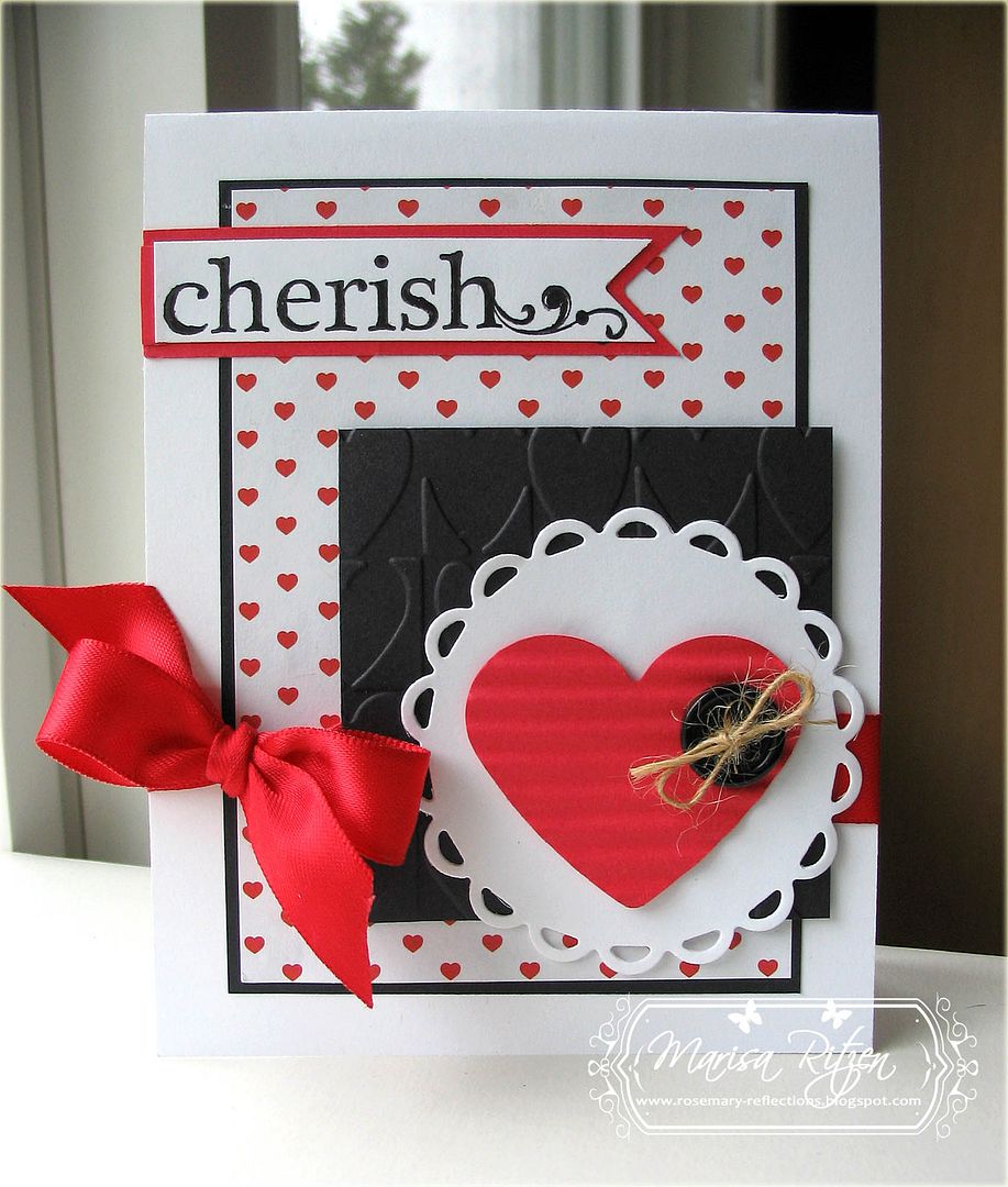
 Found this fun Sweet Shop sketch in my sketch file and decided to give it a go. Opted for a little more dramatic Valentine's Day card made with red and black. Even used two more goodies from my "to be used later" pile - yeah!
 Had a big issue with the sentiment. Swapped it out about three times as the font just didn't match the rest of the card - ever happen to you? I'm not totally satisfied with this one (due to the sentiment panel issue), but ran out of options, so this is what I had to to with... :(
Good news is, this card is in the past and I can move on to another one! That's what I love about his hobby :)
Have a fabulous day everyone and thanks for visiting today. Your company is always appreciated!

What's In It?
Stamps: Studio G (Michael's)
Paper: Read Red, Black, Red Hearts (Recollections)
Ink: Black
Accessories: Lacy Circle Nesties, Heart Punch (Marvy), Heart Blocks Embossing Folder (Provocraft), Crimper, 5/8" Red Satin Ribbon, Button, Twine, Glue Dot, Dimensionals
21 comments:
I think it turned out wonderfully! LOL if I can't get a font to work...I normally leave it off. I know the frustration for sure!
I'm sure we all have those issues and worse. LOL I know I do. Your card is so pretty, Marisa, and the little hearts on your paper are so sweet.
You did great! I love that ribbon -- gorgeous red
I am loving this card, Marisa! Love red and black together, and your style is always my favorite of them all! ;D
Hugs!
Can't wait to see your next creation!
I like the card! I know what you mean about not being able to find the right sentiment...and it is completely silly in my craft room where I have been collecting stamps for ages.
Fabulous card! Yes, I am a picky font user, so I know exactly what you mean!! Hugs!
Loving the strong, bold colours...You're getting quite the lovely collection of Valentine's!
Those pops of red really make this card stunning!
What a beautiful card! I have that same issue about not finding the right sentiment....alot! I usually end up finishing a card in 2-3 hours instead of 1 hour, because I can't decide on what to use! LOL!
This is just charming Marisa!! I love the cherish banner and that you made the heart the focal point!! LOVE the dramatic colors too. So striking!
I think it is perfect and a nice sentiment. Love the bold red & black combo.
I love the sentiment...big & bold, just like the card! That DP is fabulous!!!
Love the colors and design, Marisa! Great Cherish sentiment, too!
Red, white and black are such a classy combination! Love the crimped heart with the button and that pretty font!
This is one sweet Valentine! Love it!
'Fun' is not a word I'd use to describe this sketch, lol! Pretty scary, I'd say!! Once again you've 'nailed it' and your card is fabulous!
xx
Fonts make a big difference, don't they? This is so lovely!
Great card...I hope you'll link up at 52 Card Pickup again this week!
http://www.oldbackporch.com/2013/01/52-card-pickup-23.html?m=1
There's nothing like classic black, red and white, Marisa! Love how you've tied in all the hearts...embossing folder, designer paper, die cut! I know what you're saying when it comes to sentiments...it just has to feel right...font...size etc. Have a great weekend!
Beautiful valentine, great clean feeling. Trying to catch up as I was gone last week. Ssshhhh... noone knew! ;0)
I know what you mean about trying to find a sentiment to match the style of the card. I think this one works beautifully! Love the embossed black panel and perfect red bow.
Post a Comment